Project Overview
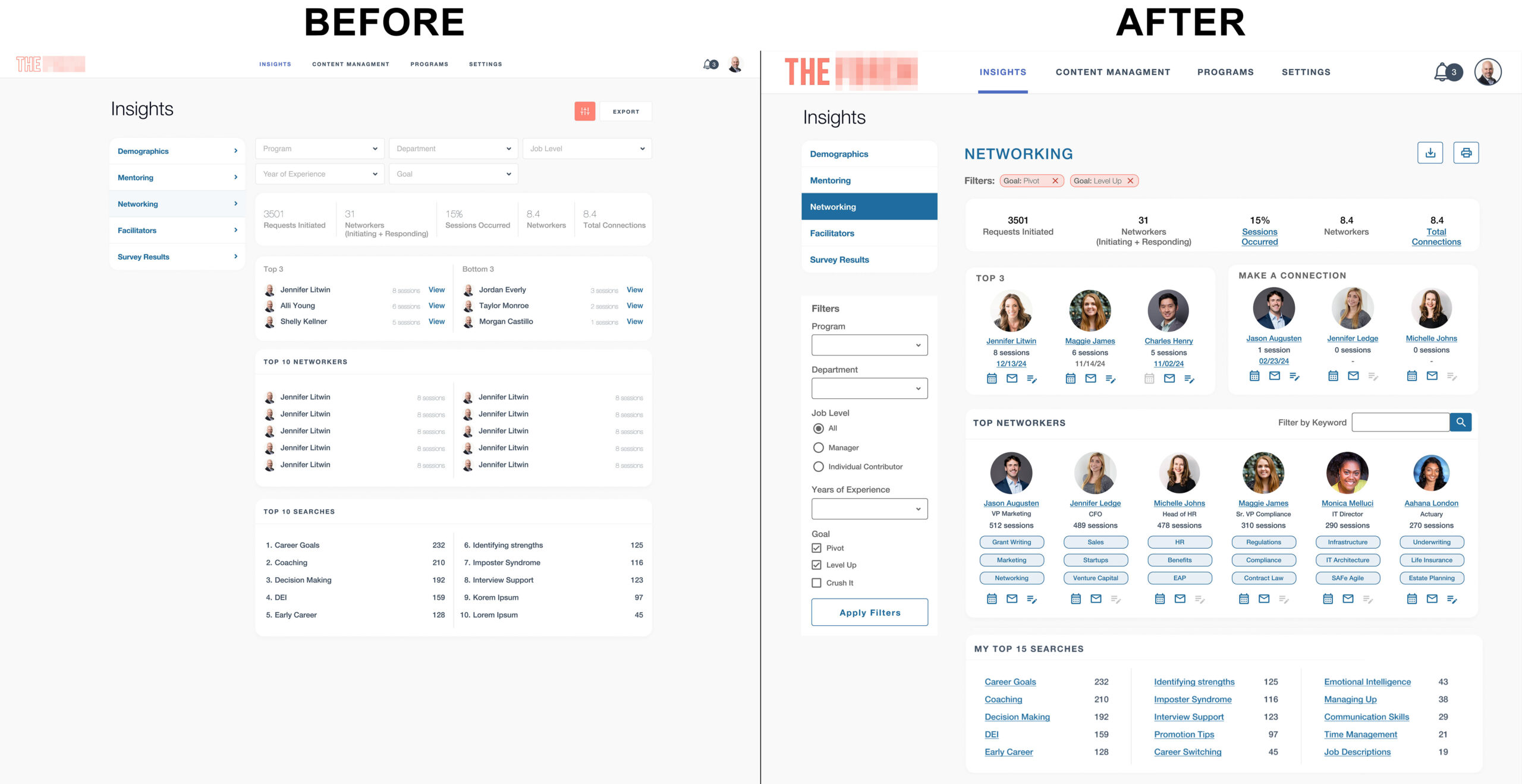
The networking application initially launched with a minimalist, tiny, and light grey design, leaving users struggling to navigate and interact with key features. With poor readability, inconsistent usability, and no attention to user demographics, the app failed to meet user needs and expectations. The redesign aimed to create an intuitive, accessible, and engaging experience by conducting in-depth user research, focusing on personas, screen resolutions, and specific user behaviors.
Problem Statement
The original design of the networking application posed several significant challenges:
- Minimalist design: The minimalistic approach led to poor legibility, causing users to struggle to navigate the interface and interact with elements.
- Lack of user research: Minimal research was done on user demographics, screen resolutions, or how users engaged with the platform, resulting in a design that failed to meet user needs.
- Confusing visual hierarchy: Important elements like page titles, profile icons, filters, and alerts were either too small, poorly contrasted, or difficult to read, making it hard for users to interact effectively.
Research & Insights
Through extensive research, including user personas and analytics review, several key insights were gathered:
- Persona analysis: Users were diverse, spanning multiple age groups and professional backgrounds. Many users accessed the platform on various devices with different screen sizes.
- Behavioral data: We identified that users primarily used the platform to connect with peers, search for networking opportunities, and engage with specific content based on skill sets.
- User pain points: Issues like difficulty reading text, navigating through pages, understanding alerts, and engaging with networking tools were highlighted.
This research provided the foundation for a design that better aligns with user expectations and facilitates smoother interactions.
Design & Solutions
The redesign focused on making the application more readable, accessible, and visually engaging by improving key interface elements. Below are the details of the redesign:
Header – Logo, Main Navigation, Profile Actions
- Logo
- Issue: The original logo was a barely perceptible outline, which contributed to an overall unprofessional appearance.
- Solution: The logo was redesigned with filled text and an appropriately contrasting outline to improve visibility and brand recognition. This created a stronger identity for the application.
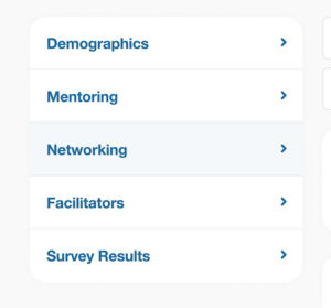
- Main Navigation
- Issue: The navigation was too small and lacked clear indications of which page the user was on.
- Solution: The header navigation was increased in size, with a thick bottom border to highlight the currently selected menu item. This provided users with clear feedback on their location within the app.
- Alerts and Profile Access
- Issue: The alerts icon, indicator number, and profile image were too small to read or access. It was impossible to tell if there were alerts to act on or that the profile image was an interactive element.
- Solution: Increased the size of alerts and profile icons for better interaction and readability, ensuring users could easily see and act upon them.
- The images below show the before and after at the same width, the difference is dramatic and shows how making small changes to font size and contrast can enhance the user experience.


Page-Level Navigation and Page Titles
- Page Level Navigation
- Issue: The previous page-level navigation was hard to distinguish due to its light blue background, making it difficult for users to understand which page they were on.
- Solution: Updated the navigation to a dark blue background with white text, providing a stronger visual cue for the active page.
.
- Page Titles
- Issue: Users had difficulty understanding where they were within the application and which page they were on if a sub-page of the main navigation.
- Solution: Added H1 titles to each page so users always knew their location.
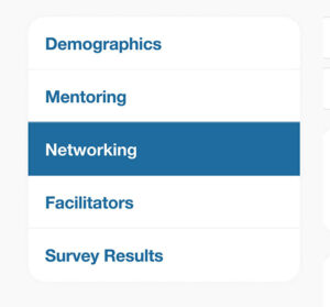
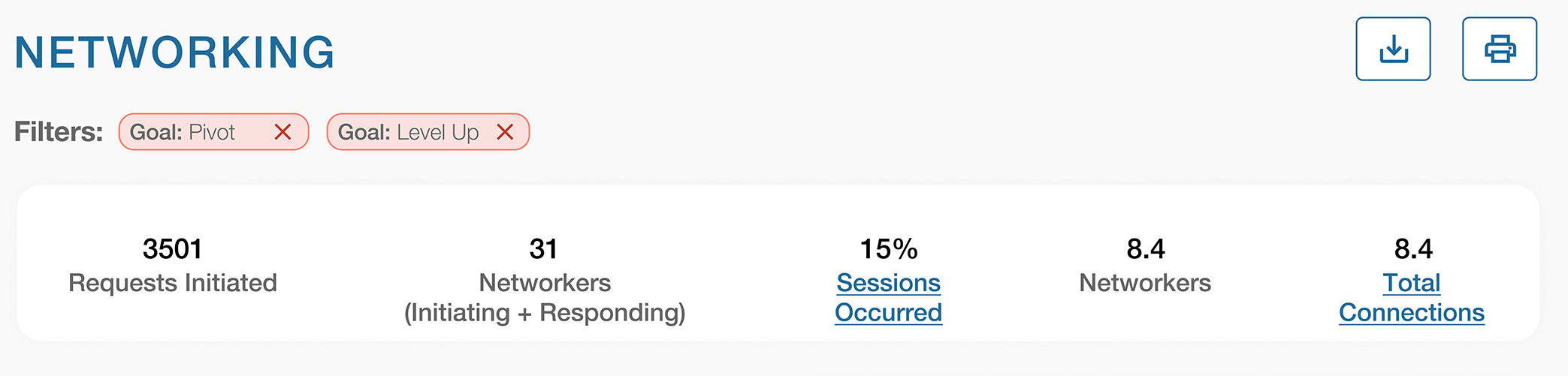
- Important Numbers
- Issue: The numbers section featured text that was too light, aligned to the left, and very hard to read.
- Solution: The numbers were updated to a darker color, centered for better visual appeal, and made interactive by adding clickable titles that took users to additional details.
The top of the page before
The top of the page after
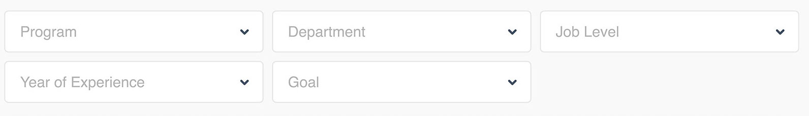
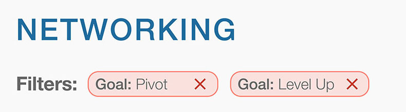
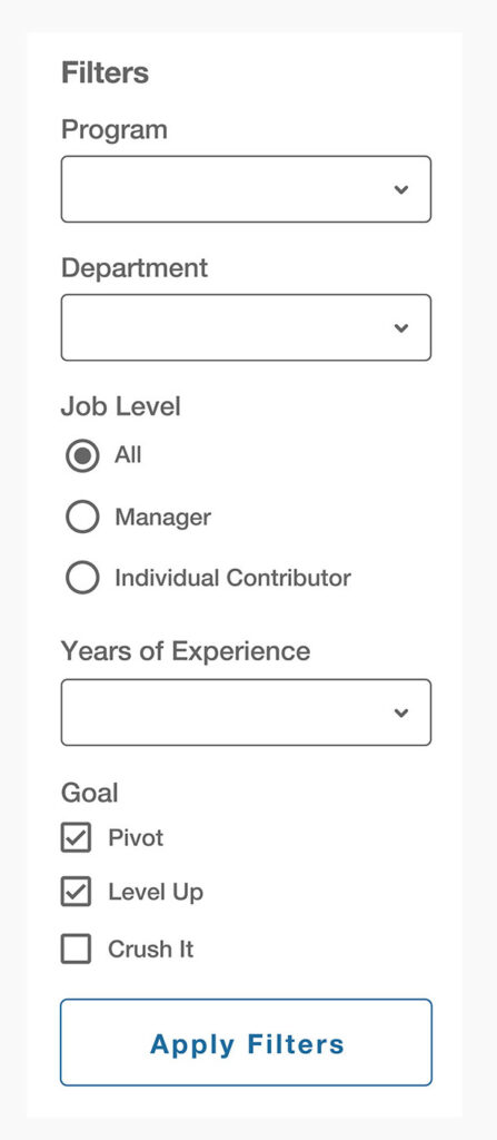
Filters & Search Functionality
- Issue: The filters were hard to read due to the light grey-on-white design. Many options were hidden in dropdown menus and not easily visible or accessible.
- Solution:
- The filters were redesigned with higher contrast, now placed on the left side of the page for easy access.
- Dropdown items were replaced with radio buttons and checkboxes, making all options immediately visible and simple to interact with.
- Filter Chips: Added filter chips at the top of the page so users could easily see what filters were applied.
Filters Before
Filters after, on the left side of the screen and at the top of the screen the active filters are shown as chips:
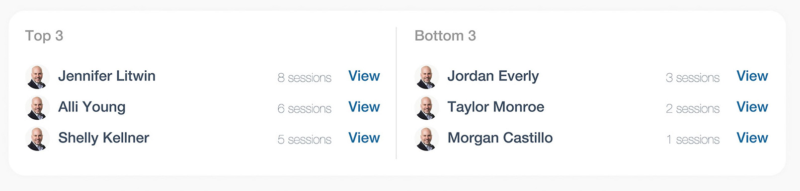
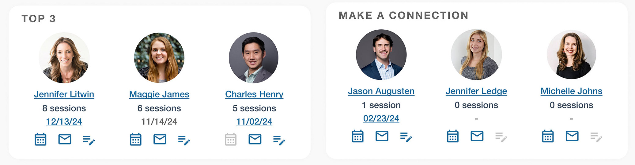
Top and Bottom Three Networking Areas
- Top 3 Networking Section:
- Issue: The original “Top Networking” section displayed tiny fonts, tiny images, and almost invisible numbers, making it difficult for users to interact with.
- Solution: This section was revamped with larger photos of network members, session counts in prominent text, and action buttons for booking a meeting, sending an email, or adding a note. The titles linked to the users’ profiles, and the date of their last meeting was displayed if no notes were available.
- Bottom 3 Networking Section:
- Issue: The “Bottom Three” section felt negative and demotivating for users.
- Solution: Replaced the “Bottom Three” with a more positive call to action—“Make a Connection.” This prompted users to take action and connect with others, fostering a more positive user experience.
Before and After
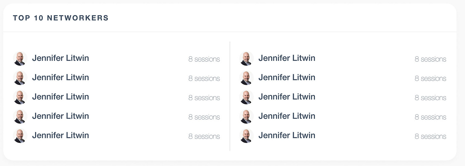
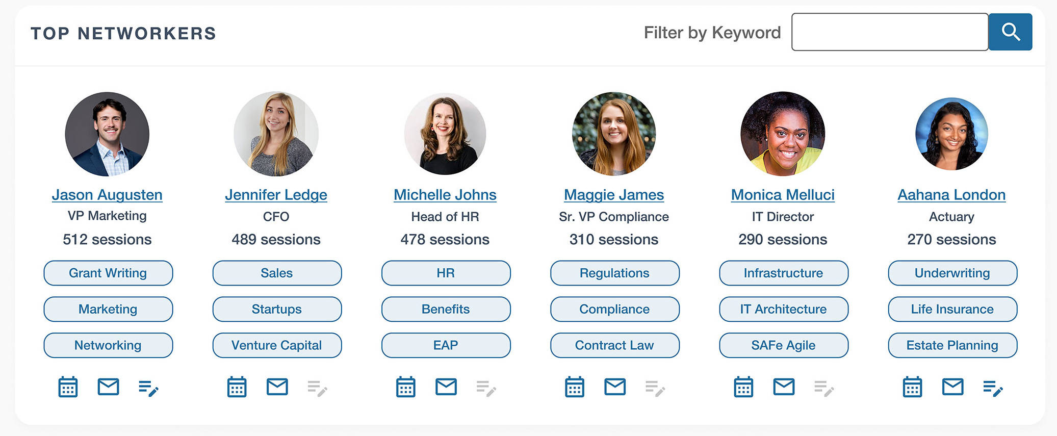
Top Networkers Section
- Issue: Small, pale text and images that were hard to read, no call to action, no interest driving keys.
- Solution: This area was transformed into a visually rich section. Each network member is now displayed with a clear, clickable photo, their name, and title, with direct links to their profiles. The section also includes key metrics, such as the number of sessions they’ve had overall, and three keywords associated with their top skills for easy filtering. Action buttons were added to streamline connections, allowing users to reach out, book a meeting, or connect quickly. A keyword filter was also integrated, enabling users to find others with similar skills or expertise, making the networking experience more interactive and personalized.
Before and After
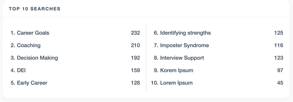
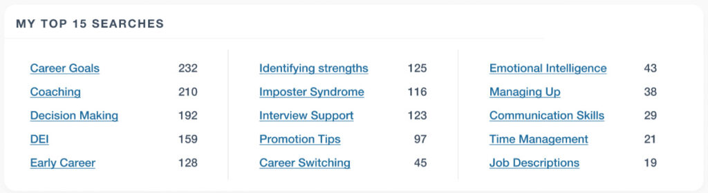
Top Searches Section
- Issue: The “Top Searches” section was hard to read due to poorly formatted, oddly numbered lists with small fonts.
- Solution: The section was redesigned into a clean, three-column layout with readable text and clickable keywords. This allowed users to easily see the most relevant searches and interact with them.
Before and After
Outcome & Results
The redesign significantly improved the networking application’s functionality and visual appeal. Key outcomes include:
- Improved usability: Clearer navigation, enhanced readability, and better interaction elements led to a more intuitive and user-friendly interface.
- Increased engagement: Users spend more time on the platform and interact with networking features more frequently, boosting networking activity.
Key Takeaways
- User-Centered Design: I conducted thorough user research, including persona development and behavioral analysis, and ensured that the redesign met the user base’s specific needs and preferences.
- Accessibility: Using better contrast, larger text, and clear navigation catered to users with different needs, improving overall accessibility and increased interactions with calls-to-action.
- Engagement: Replacing negative language with positive actions (“Make a Connection”) created a more encouraging environment for users to engage with networking features.
The revamp of this networking application highlights the importance of user research, intuitive design, and a clear visual hierarchy in creating an effective and enjoyable user experience.
Skills
- Accessibility
- Auditing
- Remediation Documentation
- Content Writing
- Design
- Figma
- Photoshop
- Responsive Design
- UI Design
- Information Architecture
- Product
- Documentation
- User Experience (UX)
- Personas
- Research
- User Journeys
- User Testing
