Background
Tile is a popular product that helps users locate their belongings by attaching small Bluetooth-enabled devices to items like keys, wallets, and electronics. With the Tile application, users can see a list of their Tiles, each representing an item they’re trying to keep track of. However, as users accumulate more Tiles, finding a specific item can become increasingly difficult, especially when there’s no clear way to filter or sort the list.
Challenge
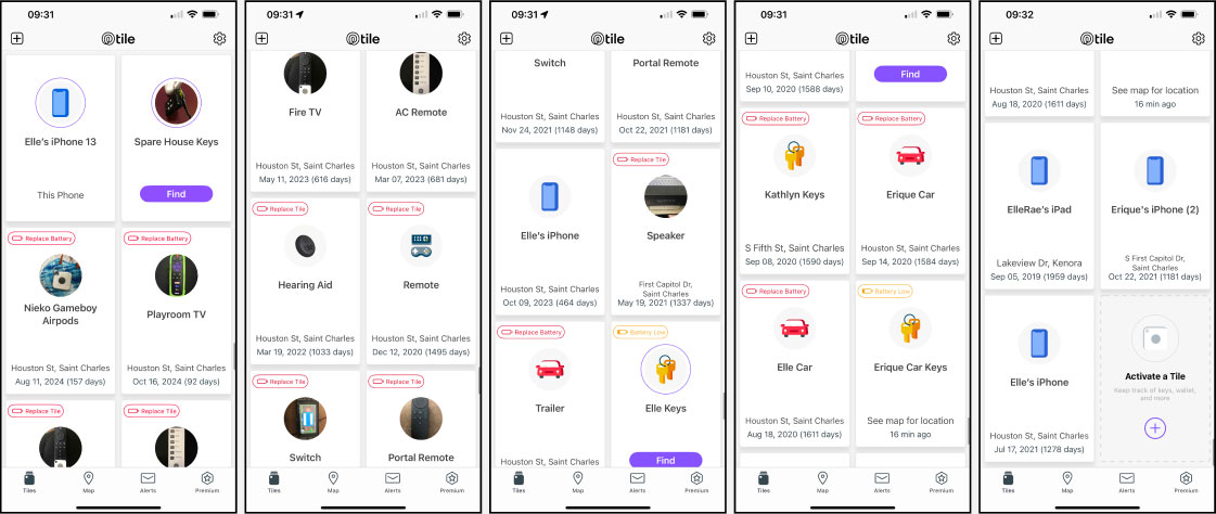
The primary issue with Tile’s Find page was the lack of organization for users with a large number of tiles. With over 75 items, I could not easily sort or filter my items and it takes nearly a minute to find the Tile I want to chime. The application displays Tiles in a random order, without categorization or logic, which made locating an item incredibly difficult. The need for a more intuitive, structured approach was evident.
Solution
To address this challenge, I redesigned the Tile find page to make it easier to filter, search, and quickly find items. The main idea behind the redesign was to create a logical structure for organizing items based on the user’s needs, allowing them to locate things quickly, even if they have a large number of Tiles.
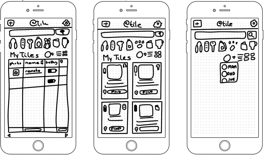
- Sketching Initial Ideas: I began by sketching potential solutions, keeping in mind that users need to identify their items by what they are and who they belong to. For example, users should be able to filter items by categories like headphones, remotes, wallets, and pets, or by specific people like everything associated with Elle or Erique (e.g. Elle’s Wallet, Elle’s Red Headphones, Elle’s Keys, etc.).
- User-Centric Filters: The key design principle was to allow users to find items by their most common characteristics. I incorporated two main methods of categorization:
- Filtering by Person or Item Type: Users can filter their list of Tiles by who owns them (e.g., “Elle’s headphones”) or by item type (e.g., “headphones” or “wallet”).
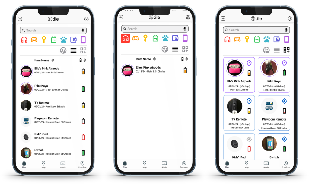
. - Search Box: A search box was added at the top of the page, enabling users to search and filter the list quickly and help them find their items in seconds.
- Filtering by Person or Item Type: Users can filter their list of Tiles by who owns them (e.g., “Elle’s headphones”) or by item type (e.g., “headphones” or “wallet”).
- Category-Based Grouping: In addition to the search, I included a set of buttons that allow users to filter items by common categories like headphones, remotes, keys, pets, wallets, and backpacks in the example. These categories would initially be set automatically by the app (based on the number of items in each group) but could be customized by the user for greater flexibility once they exceed the number of visible slots (or that area could scroll horizontally to show all categories). AI would be used to categorize items that don’t fall into normal categories. For example, we put a Tile in our oldest child’s band folder to ensure it doesn’t get left behind.
- Improved Layout: The original design didn’t provide much contextual information. I redesigned the layout to offer both a tabular format (rows) and card format (larger squares), allowing users to choose the layout that best suited their preferences.
- Visual Proximity Indicators: To improve item discovery, I introduced visual proximity indicators in the form of colors and icons:
- Purple location icon and a slightly thicker purple border.
Indicate the item is nearby and ready to chime. - Blue location icon and border.
Indicates the item is within range but not close enough to chime. - Grey location icon and grey border.
Indicates the app cannot detect the item’s location. - Icon Differentiation
I also added a target icon for home base location and a map marker for nearby items.
This visual representation helps users quickly assess where their items are located.
- Purple location icon and a slightly thicker purple border.
- Battery Status: I added battery details for each item to streamline the process further. Users can now view the battery status using color coding and images to show how much battery is left. This makes it easier for users to spot low-battery items and replace them all at once.
Results
The redesigned find page significantly improves the user experience, especially for users with many Tiles. Key benefits of the redesign include:
- Faster Item Discovery: Users would be able to filter by item type, owner, or search terms, dramatically reducing the time spent locating specific items.
- Better Organization: Categorizing Tiles into logical groups ensures that users can see their items organized in a way that makes sense to them.
- Proximity and Battery Awareness: Visual proximity indicators and battery status allow users to stay informed about their items’ location and battery life, minimizing the chances of a Tile running out of power unexpectedly.
By introducing these enhancements, the Tile application could provide a more efficient and user-friendly experience for managing a large number of Tiles. The added flexibility of custom filters, search options, and proximity indicators makes it easier than ever for users to locate their belongings.
Conclusion
The redesign of Tile App’s find page successfully addresses the challenge of managing a large number of items. With an emphasis on user-centered design and intuitive filtering, the updated page enhances the user experience, allowing users to quickly locate their items while staying informed about their battery status.
This case study demonstrates how thoughtful UX/UI improvements can transform a product, especially for users with complex needs. It highlights the importance of providing customization and flexibility in user interfaces.
Skills
- Design
- Accessibility
- Mobile Responsive Design
- UI Design
- Development
- Prototyping
- Information Architecture
- Mobile App
- Product
- Documentation
- User Experience (UX)
- Research
- User Journeys
- User Testing
- Wireframing