Talkspace is an online mental health services provider offering services to around 15 M individuals (Larson, 2023). With more than 50 employees and offering a public service, they must be ADA compliant (for their external services as well as internal). Because they offer government plans, they must also be 508 compliant (Talkspace number of employees 2020-2023: Talk 2023, 2023).
This audit will cover some issues on the home page. Why only identify some issues? Because, unfortunately, the list of violations is too extensive to detail. While extensive, fixing these issues would take less than a sprint for an experienced accessibility developer.
Quick Links
Home Page
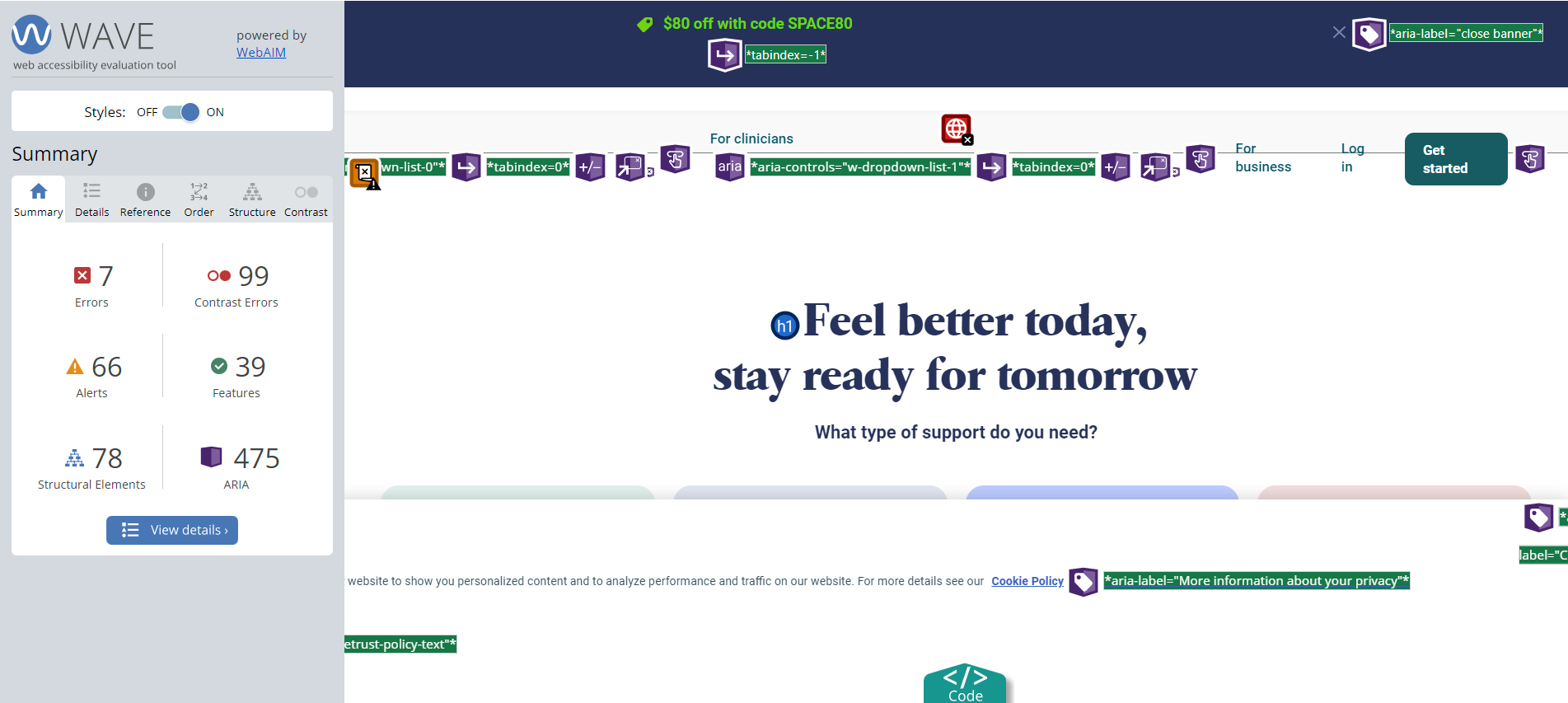
I like to start with the Wave plugin as it gives me a quick understanding of some of the surface issues I should expect to encounter (and that may cause issues with assistive technologies I use during testing). Immediately, we see seven errors, 99 contrast errors, and 66 alerts. What’s more concerning to me are the 475 Aria references. No aria is better than bad aria.
Bad Aria
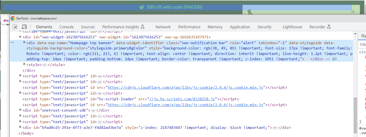
An example of bad aria is the below link that shows a bold blue underlined link named Cookie Policy, but, as the Wave tool shows, it has an aria-label of “More information about your privacy.”
While this seems like a well-intentioned effort to provide a better explanation of what “Cookie Policy” is, adding an aria-label is problematic for several reasons:
- It overrides the link from saying “Cookie Policy” to someone using a screen reader. They’ll hear, “More information about your privacy.” instead. So while Cookie Policy would say the intention of the destination, “More information about your privacy.” is not clear but that’s what someone will hear. To me that sounds like a privacy policy, not a cookie policy.
- Someone who uses a screen reader and who can see the screen will be confused because they’ll focus on a link called “Cookie Policy,” but will hear something different.
- Someone using speech to navigate won’t be able to access this link because they’ll have no idea it’s called “More information about your privacy.” in the code.
If the link needed to be explained, it should have said, “For more information about your privacy on our website, visit our Cookie Policy.” (Note that the blue and underline on the word Cookie Policy is meant to show what it would look like, it is not an active link.)
I won’t go through every issue in the Wave report, but the above is an example where an automated scanning tool won’t identify a problem. It doesn’t see Aria labels as a problem because it can’t understand its context.
Keyboard Testing
First Interactive Element
The first thing I do when I manually test is to tab into the page. At Talkspace, the first interactive element is their logo… except it’s not. Visually, it’s the neon green text in the top banner, but that link and the close button on the banner are bypassed because they are at the very bottom of the DOM before the close body tag, which means they will be the last thing a user can focus on using the keyboard.
The first interactive element should be a skip link, allowing keyboard users to skip the repetitive top navigation. Then, on this site, the banner link (which I could not tell was a link because there’s no indication that it is – it’s neon green on dark blue, but since my keyboard doesn’t focus on it and it has no visible indication that it’s a link, how would a user know?) then the close button for the banner, then the logo.
Logo
The Talkspace logo has no alt, so it reads out as www.talkspace.com. While they have the text “Talkspace home” in their code, it has a class of “hide” on it; that class is display: none; which is hidden from the screen and a screen reader. Since the logo is inserted with CSS as a background image, this is where aria-label=”Talkspace Home” would be appropriate. Though that won’t help someone who can see the page and has images turned off. There are a lot of considerations when it comes to using CSS for images. The best fix would be to have the image actually there with an appropriate alt.
<a href="https://www.talkspace.com/" id="w-node-ab482f7c-a865-1e47-5794-0a6b3985991b-39859915" class="logo-link w-nav-brand dynamic-url"><div class="hide">Talkspace home</div></a>
Focus Indicator
That said, they have a great focus indicator on their logo, a nice offset outline.

Unfortunately, that fantastic focus indicator doesn’t show up when you’re on the drop-down items in the menu.
Drop Down Navigation and Mega Menu
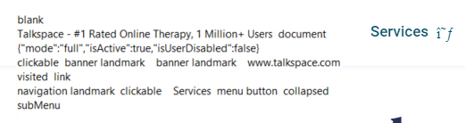
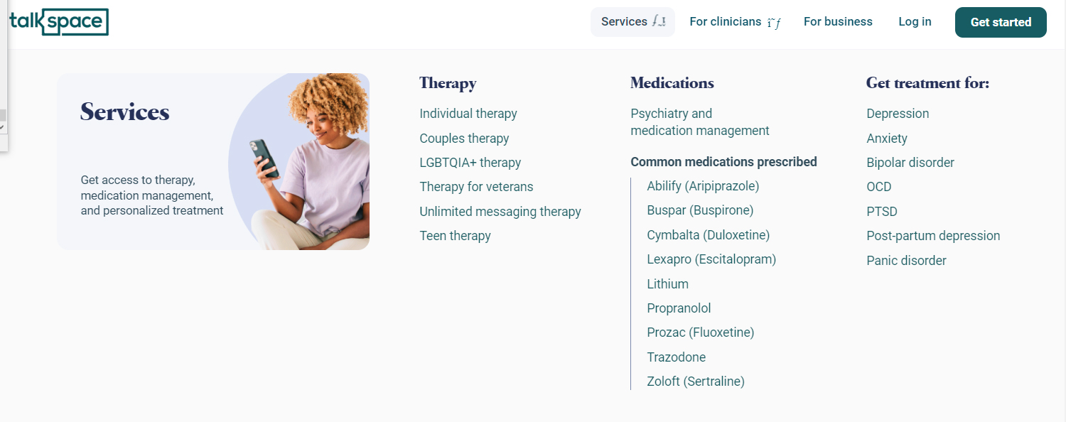
In the image below, I am focused on the “Services” menu (which seems to have a broken icon that I imagine should be a down arrow) – my screen reader announces that I’m on the Services menu item. Still, I have no idea where I am if I’m using a keyboard without a screen reader. The screen reader reads, “navigation landmark clickable Services menu button collapsed subMenu”
While the focus indicator isn’t present, there are positives about that code;
- It is within a navigation landmark (but it seems the landmark doesn’t have an aria-label that provides information about what it is the navigation for – why that is important is discussed later).
- It announces as a menu button and is collapsed, telling me that I can open it to expose more items.
- I’m able to expand it, and it announces as expanded.
- Reading it is acceptable (using arrows to read – since there is text on the left side); however, if I tab through the links, I don’t know that the headings group them. If there were fieldsets around the grouped links, and they were coded as lists, I would be told that Depression and Anxiety are under the grouping “Get treatment for:” and that there are seven items in that list.
Image description: The Services menu is open. The Services link has a barely discernible grey background with rounded edges and no border. The mega menu has a light grey background and is separated into four columns. The leftmost column has an image of a woman with light brown, naturally curly hair, medium-tone skin, a lavender shirt, white pants, and a smartphone. The text on the image says Services, then Get access to therapy, medication management, and personalized treatment. The second column has a heading of Therapy with six types of therapy listed (not coded in a list), the third column has a heading of Medications with Psychiatry and medication management then another smaller heading of Common medications prescribed and a list of nine medications and a vertical border on the left. The final column has a heading of Get treatment for with a list of seven common behavioral health diagnoses.
Menu Navigation
I can navigate through the menu using the tab key, which is fantastic. The arrow key reads the text, which is fine, but it would be nice if it navigated the items (while showing focus) and allowed me to read the headings. Unfortunately, when I tab after Panic Disorder (the last item in the fourth column), the focus goes to the next item in the navigation called “For clinicians.” But, the mega menu for Services remains open while focusing on the new menu item and only disappears once I open the For clinicians menu. Once I’m on the For Clinicians menu item and open it, I can’t tell where I am as there is no focus indicator in the drop-down items; in this image, I am on the Prescribers link with my keyboard, but you’d have no idea as there is no visual indicator showing where I am.
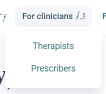
The same light grey background is on this menu item when active. Ideally, the active menu item should have a more discernible contrast of at least 3:1, this can be achieved with a 2px solid outline with appropriate contrast.
Button Focus Indicator
There is a great focus indicator on the non-drop-down items in the menu and an outline focus indicator on the Get Started button, but because there’s no padding between the dark teal and the black outline, it’s difficult to tell that one’s focus is on that button with only a 2.3:1 ratio. If there was a slight padding between that black outline and the teal button, it would be much easier to see.
All of these issues, and we are still in the header. Speaking of …
Landmarks
Do you remember when I mentioned that the navigation should have a name? Landmarks are the reason why. When I look at the landmarks on the TalkSpace home page, I see “banner” which is the header, the section at the top of the page that is repeated on every page and contains a landmark of “navigation,” then there are two carousel landmarks a content info landmark (this is the footer) and a Cookie banner landmark (a temporary banner asking people to accept the website’s cookies).
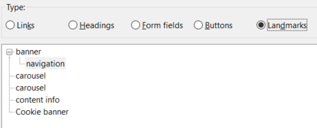
Why is it a problem that the top navigation doesn’t have a name? Because it’s not the only navigation on the page. The content info area (footer) should have navigation landmarks in it as well. One for Services, Useful Links, and About – the three columns of links in the footer. And yes that means that the different carousels should have unique names.
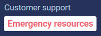
Footer Link Contrast
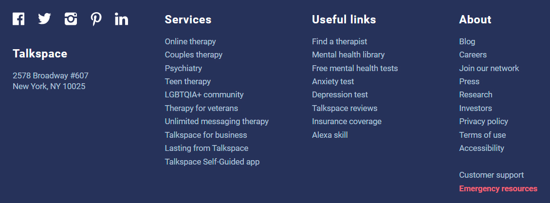
Now would be a good time to mention the lack of contrast with the Emergency resources link, which is a sort of salmon color that only has a 3.98:1 ratio with the dark navy background. Adding a simple white background, some padding, rounded borders, and increasing the size to the 12 pt = 16 px = 1 rem minimum per usability.gov, would allow this link to stand out. However … this poses a new issue as it looks like a button but will announce as a link; however, links take you somewhere and buttons do something so a link is appropriate in this instance. An underline would further enforce that this is a link, not a button.
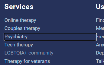
Back to the footer navigation, while we’re down there, they barely change color when hovering over the very light links. In the image below, the LGBTQIA+ community link is being hovered over. While the keyboard focus is great, as shown on the Psychiatry link below, it overlaps the right navigation. Rather than put the focus on the li element, the focus should be on the a element.
Back to the body of the page … which also happens to be missing a main role as shown in the landmark section.
Return to Quick Links
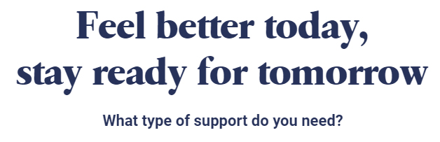
H1 – Heading 1
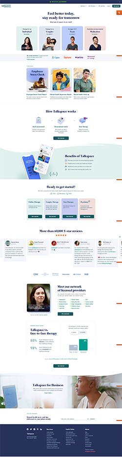
The H1 on this page is “Feel better today, stay ready for tomorrow” which is excellent, though it has a tiny bit of text under it that looks like a heading but isn’t coded as one, which can be confusing. I’m not saying that it should be a heading, just that it looks like one compared to other headings on the page.
Calls to Action
Below the H1 are four calls to action shown as four pastel rectangles with what look like headings and possibly a link and an image. Very diverse images, which is great. And look at that nice dark and noticeable focus indicator! So what’s wrong with this area?

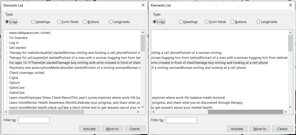
This area looks great … but it doesn’t sound great. The image below shows that the four calls to action announce as:
- Therapy for meIndividualGet startedWoman smiling and holding a cell phonePortrait of a woman smiling
- Therapy for usCouplesGet startedPortrait of a man with a woman hugging him from behindPortrait of a man with a woman hugging him from behind
- For ages 13-17TeensGet startedTeenage boy smiling with arms crossed in front of chestTeenage boy smiling and looking at a cell phone
- Psychiatry and prescriptionsMedicationGet startedPortrait of a smiling womanWoman smiling and looking at a cell phone
That was a mouthful! So what’s going on here? The link to the page is wrapped around the entire rectangle that contains the bolded words “Therapy for me” then under that larger bolded word of “Individual” then a little thing that is bold teal colored text with a greater than sign to the right of it, it is trying to look like a link and says “Get started,” then there is a decorative image at the bottom of this rectangle that shows a young Asian woman with long black hair, wearing a black sweater with stripes, who is holding a cell phone when the image is hovered over. Both the non-hovered state of the image and the hovered state have alt text associated with them.
So should the alt text be changed? No. They are decorative images and if they were removed for people who could see them they would not lose any information. They should have an alt=”” (alt equals nothing, not alt equals space or alt equals null but alt equals quote quote) so it doesn’t announce or aria-hidden=”true” to hide the image from the screen reader.
Doing this would allow the links to read better as “Therapy for meIndividualGet started.”
Note: The lack of spaces between words is how they show up in the screen reader – they will announce fine as there are capital letters separating the words. This is also why you should #UseCapitalsInHashTags so the words announce correctly.
We’ve finally hit the bottom of the fold!
Return to Quick Links
Additional Issues
Rather than go through the rest line by line (which it could certainly use) here is a quick list of some additional issues:
- There is an element with aria-hidden=”true” but it has focusable content.
- There are multiple instances where what you see is not what you hear, including the Cookie Policy link identified earlier.
- There are multiple decorative and spacer images missing alt=””.
- There are over a half dozen empty links (including the logo).
- A video plays for longer than 5 seconds without a way to pause it.
- The page is missing its language.
- It’s preferable to use <strong> instead of font-weight: bold.
- Server configuration issues with MIME types.
- There are multiple H1 elements.
- Multiple instances of script elements with an async attribute but type=”module” isn’t identified.
- There’s a rogue (and inappropriately placed) link in the head without a close tag.
- Duplicative meta tags in the head.
- Multiple instances of small fonts, usability.gov states that font sizes should be no smaller than 12 pt = 16 px = 1 rem.
- Instances of buttons with an action in the same color as the background.
- Underlined text that mimics a link.
- Several instances of deprecated CSS like scrollbar-arrow-color.
- Not a critical issue but you don’t have to add the role=”navigation” when using the <nav> element. However, you should have an aria-label on those nav elements identifying what they are the navigation for, e.g. Main or About Us.
- Tab indexes are used throughout and should not be used to force interaction. Even if used on already interactive elements (where they aren’t necessary). These are used in the mega menu, which is another indication that this isn’t coded in the best way.
- Abbreviations used without explanation of what they mean.
- Multiple instances of no alt and hidden words.
- Duplicated images with the same alt text beside each other.
- Excessively long link text.
- Many items that look like links (based on some that are), but they aren’t.
- Multiple instances of generic interactive elements with the same words.
- Multiple instances of links that look like buttons.
- Scrolling marquee that users are unable to stop because the pause control doesn’t work.
- Small light grey text that are links but are not indicated as such.
- Links that go to an external 3rd party site but do not notify the user of such.
- List items that are colored to look like links, but are not.
- Hover contrast on links does not meet minimum contrast requirements.
- Multiple instances where the focus is the same as the unfocused state (like the menu drop-down items).
- Multiple links that have IDs but no href and will not work correctly in VoiceOver (which includes iDevices).
- Unnecessary roles on elements, like role=”list” then necessitate additional roles on the children, which are not there creating a violation.
- Interactive elements below the minimum required touch size.
- Charts without text descriptions of the chart data.
- Interactive elements that can only be activated with a mouse, and then dynamically change data on the screen without announcing the change.
- Form field elements without associated labels.
- Errors are identified by color only.
- Spelling issues, words without spaces between them, which mean that they are difficult to read and read incorrectly by a screen reader.
- Form field errors are not associated with the fields and are not announced.
- iFrames without title attributes.
- Many pages open in a new tab without notice to the user.
Based on the above, I strongly recommend Talkspace thoroughly audit their home page and at least one internal page and remediate all of the issues on those pages as that should address most issues throughout the site. In doing so, they will make their site much more accessible (although not fully compliant until all issues on all pages are remediated).
References
Larson, C. (2023, February 22). Talkspace hits ‘inflection point’ as B2B becomes dominant revenue driver. https://bhbusiness.com/2023/02/22/talkspace-hits-inflection-point-as-b2b-becomes-dominant-revenue-driver/
Talkspace number of employees 2020-2023: Talk. Macrotrends. (2023). https://www.macrotrends.net/stocks/charts/TALK/talkspace/number-of-employees