“When designing a website, considering color contrast is an accessibility practice to ensure text is legible for users with visual impairments. Inclusivity takes this a step further by considering cultural sensitivities related to color. Some color combinations might have specific cultural connotations that could affect user experiences. By choosing colors thoughtfully and avoiding potential cultural conflicts, you can enhance both accessibility and inclusivity.”
In the dynamic marketing and design realm, where visuals are paramount, the impact of color is profound and far-reaching. Color doesn’t merely decorate; it directs attention, evokes emotions, and constructs brand identities. However, this chromatic journey is far from straightforward, as color’s significance fluctuates across cultures and borders. As marketers endeavor to craft messages that resonate universally, they must navigate the intricate labyrinth of color perception to avoid the unintended pitfalls of cultural insensitivity. Join me as I delve into the multifaceted nature of color in marketing and color contrast, and unveil the intricate tapestry of cultural interpretations that color weaves, reminding us that while the palette is universal, its shades of meaning are not.
Cultural Significance of Different Colors
Red
-

Cultural Associations: Excitement, danger, love, purity, luck, caution, religious connotations (in some regions).
- Successful Use: A popular soda’s use of red in its branding creates a vibrant and memorable image, effectively associating it with energy and enjoyment.
- Unsuccessful Use: Another popular soda faced backlash in Asia when they used a predominantly red design for a campaign, inadvertently invoking memories of local tragedies associated with red.
Orange
-

Cultural Associations: Autumn, warmth, harvest, mourning (in some regions), love, happiness.
- Successful Use: A European royal family wears orange during celebrations, embracing the color as a symbol of national identity and unity.
- Unsuccessful Use: A popular home improvement store’s entry into China failed partly because its iconic orange branding was associated with mourning and death in Chinese culture.
Yellow
-

Cultural Associations: Happiness, optimism, envy, wealth, death (in some regions), success.
- Successful Use: A popular fast food restaurant uses yellow in its branding, which creates an inviting and cheerful atmosphere, contributing to its global popularity.
- Unsuccessful Use: A global electronics company decided to use a predominantly yellow color scheme in its marketing campaign aimed at the Indian market. However, they failed to realize that in Indian culture, yellow is associated with sacredness and spirituality. The campaign was met with backlash as many customers found the use of yellow in a commercial context disrespectful and culturally insensitive. This incident highlights the importance of understanding cultural connotations attached to colors to avoid unintentional insensitivity in marketing efforts.
Green
-

Cultural Associations: Environment, progress, luck, exorcism (in some regions), patriotism, Islam.
- Successful Use: A popular coffee chain’s use of green reflects its commitment to sustainability and ethical practices, appealing to a global audience that values environmental consciousness.
- Unsuccessful Use: A popular beer with a predominantly green label/can faced criticism for using green in a commercial featuring a lighter-skinned man using a beer bottle to change a darker-skinned woman’s complexion, evoking a racially insensitive message.
Blue
-

Cultural Associations: Safety, trust, authority, masculinity, spirituality, mourning (in some regions).
- Successful Use: A social media giant’s predominantly blue logo and design contribute to a sense of trustworthiness and familiarity, facilitating global recognition.
- Unsuccessful Use: Some Middle Eastern countries perceived an international bank’s blue campaign negatively due to associations with Western influence and intervention.
Brown
-

Cultural Associations: Stability, comfort, mourning (in some regions).
- Successful Use: A popular shipping company’s use of brown in its branding suggests reliability and dependability in package delivery services.
- Unsuccessful Use: An international fashion brand launched a new line of luxury bags and accessories. To promote these products, they designed an advertising campaign that featured models posing in opulent surroundings, dressed in elegant attire, and holding the brand’s brown leather bags. However, they didn’t take into account that in certain Eastern cultures, brown is associated with mourning and is often worn at funerals. The campaign was criticized for being culturally insensitive, as the choice of color clashed with the joyful and celebratory nature of luxury fashion, leading to a significant backlash and damage to the brand’s reputation.
Black
-

Cultural Associations: Sophistication, elegance, power, mourning, masculinity.
- Successful Use: A luxury brand’s black and white branding exudes timeless elegance, contributing to its image as a luxury fashion brand.
- Unsuccessful Use: An international fast-food chain used a predominantly black color scheme in a marketing campaign to promote a new spicy menu. However, they failed to recognize that in some cultures, black is associated with mourning and is considered inappropriate for a lighthearted promotion. The campaign was met with criticism for its insensitivity, revealing the importance of understanding color symbolism to avoid alienating potential customers and causing negative perceptions of the brand.
White
-

Cultural Associations: Purity, cleanliness, death (in some regions), weddings.
- Successful Use: A popular tech company’s minimalist white packaging and products evoke a sense of purity and modernity, appealing to a wide global audience.
- Unsuccessful Use: A popular body wash and soap company faced backlash for a body wash ad that depicted a black woman turning into a white woman, perceived as racially insensitive.
As you can see, it can be very easy to use colors culturally insensitively. The same can be said when you use colors that certain people can’t see.
How Colors Impact Accessibility
- Website Design: A travel booking website used a combination of red and green colors for critical notifications and confirmation messages. However, this posed a problem for users with color blindness, as red-green color blindness is a common type, making it difficult for these users to distinguish between the two notifications. This made the website experience frustrating and confusing for a significant portion of its audience.
- Map Legends: A transportation app used color-coded icons to represent different modes of transport on its map. However, the color choices weren’t accompanied by clear labels or alternative ways of differentiating the icons. Users who were colorblind or had difficulty distinguishing certain colors found it challenging to accurately identify the various transportation options, leading to confusion and potential travel disruptions.
- Product Packaging: A food company released a new line of flavors for its snacks, using color-coded packaging to differentiate the flavors. Unfortunately, the chosen colors were too similar for individuals with color vision deficiencies to differentiate easily. This resulted in customers picking up the wrong product and being disappointed when the flavor didn’t match their expectations.
- Charts and Graphs: A financial services company presented complex data using a bar graph that relied solely on color to distinguish between different data categories. Users who couldn’t perceive the colors were unable to comprehend the information accurately, leading to incorrect interpretations of the data and potentially impacting financial decisions.
- Event Invitations: An event organization used a visually appealing invitation with light text on a light background for an evening event. This made it incredibly difficult for individuals with low vision to read the information, causing frustration and excluding potential attendees from the event.
In each of these instances, the improper use of color created barriers for individuals with visual impairments or color vision deficiencies, ultimately diminishing the user experience and limiting accessibility. It’s crucial for designers and marketers to ensure that color choices are accompanied by other accessible cues to provide a seamless user experience while being conscious of the potential cultural color implications.
How to Test for Color Contrast
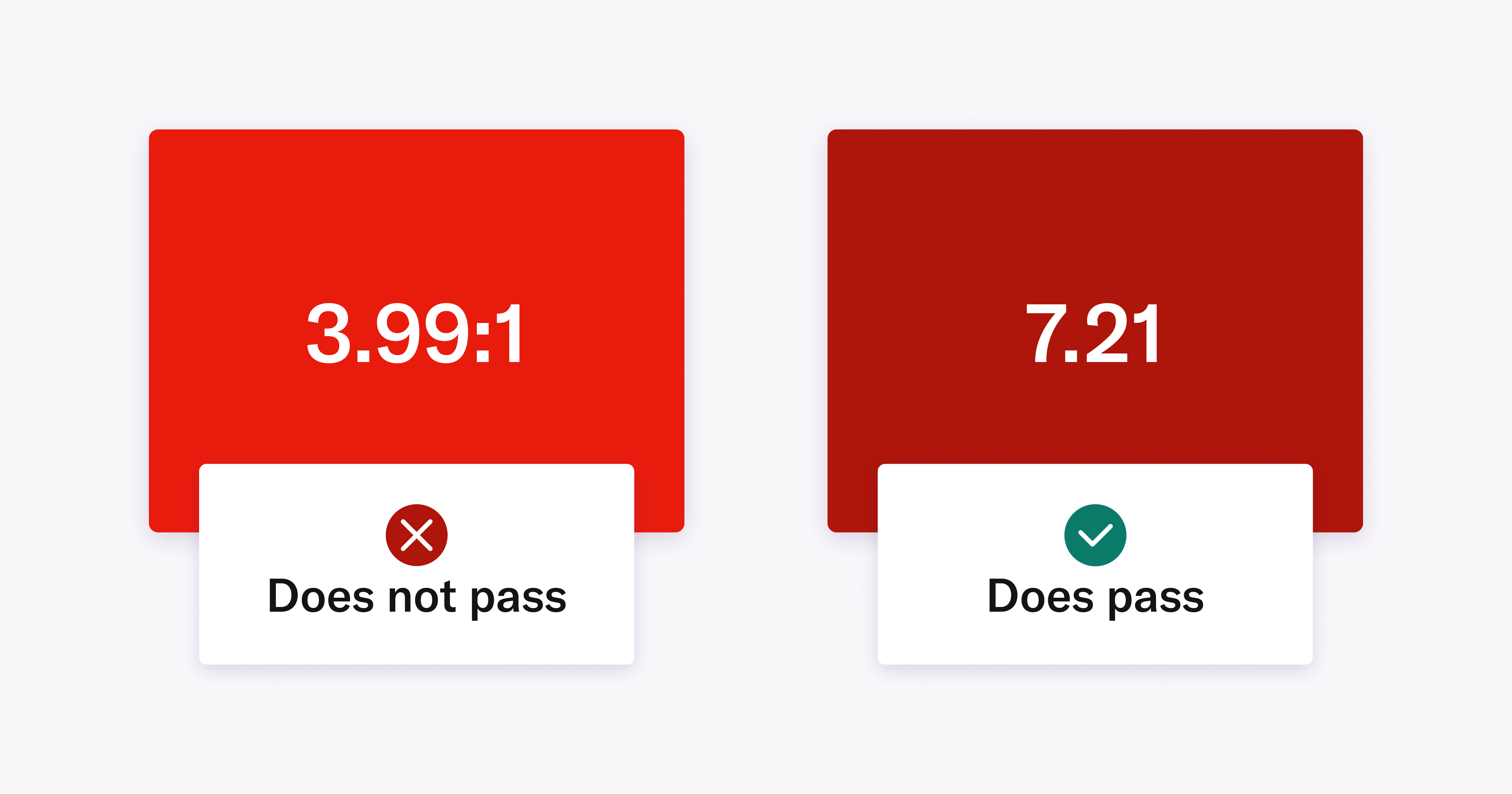
One of my favorite tools is the Colour Contrast Analyzer (CCA) by TPGi . It’s a thick client (installed on your machine) that allows you to get the color contrast of any combination of colors. What you want is a 4.5:1 or greater (7:1 is preferred) between text and its background and 3:1 for text next to links or for non-text items like buttons against the background.
Image Caption: Two large red rectangles, the left rectangle is a more pure red with white text that says 3.99:1 and the right rectangle is a darker more maroon red rectangle with 7.2:1 in white. The left does not pass contrast, the right does.
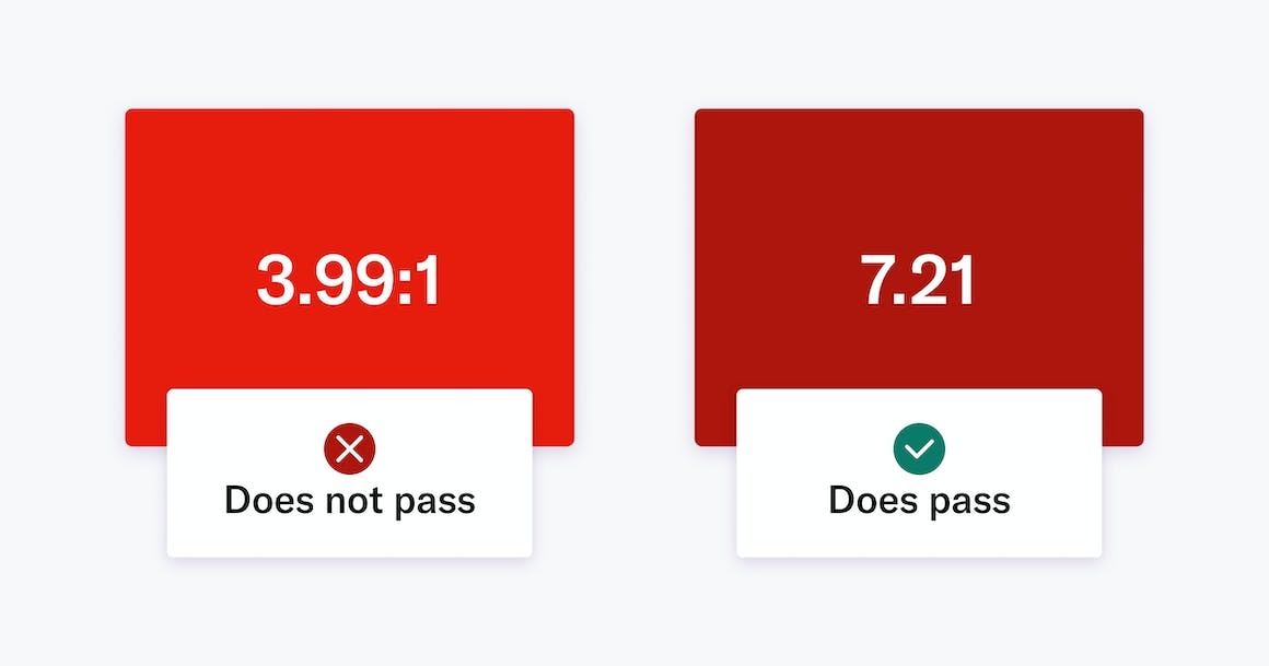
Image Reference: https://images.prismic.io/audioeye-web/be95c0ab-c681-425f-838d-29893dddc259_Why-Does-Color-Contrast-Matter-For-Website-Accessibility-WCAG.jpg
All moon paintings are handpainted by Danielle in watercolor medium on watercolor paper. You can see more at Favreaus .